Top 5 Rookie Data Visualization Mistakes: Microsoft Power BI
Sep 21, 2023
Guest post by Margaret Efron, reposted with permission. This post originally appeared here:
Whether you are just getting started with Microsoft Power B.I., or have some experience under your belt, here is a quick refresher on data visualization mistakes to avoid.
Mistake #1: Using the default titles, tooltip labels, and x- and y-axis labels.
When you craft your data visualizations, Power B.I. will automatically populate the titles and x- and y-axes with labels from your data source (for example, an Excel spreadsheet.) Just because you titled a column a certain way in your spreadsheet doesn’t mean that it will make sense to your audience.
For example, look at this data visualization below:
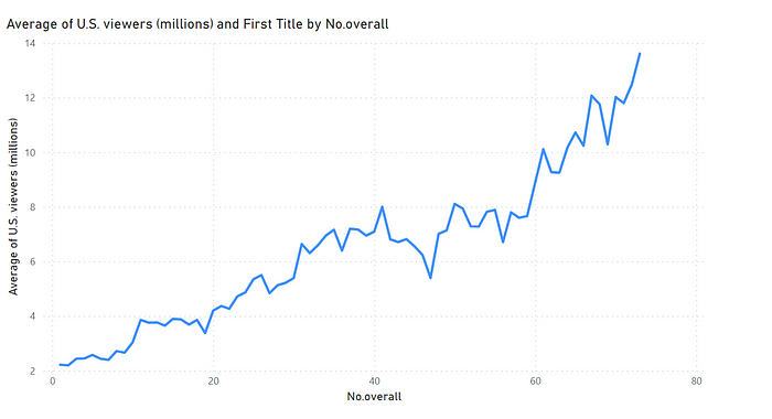
I made this data visualization to show the increase in viewership over time for the HBO series “Game of Thrones.” However, you wouldn’t know this by looking at the default title and labels.
To change the default X-axis and Y-axis labels:

→ Go to the “Visualizations” pane
→ Click the drop-down arrow next to the title for X (and/or Y-Axis)
→ Click “Rename for this Visual” and enter a new title. Make sure to also edit the labels for your Tooltips, if applicable.
To change the default title:
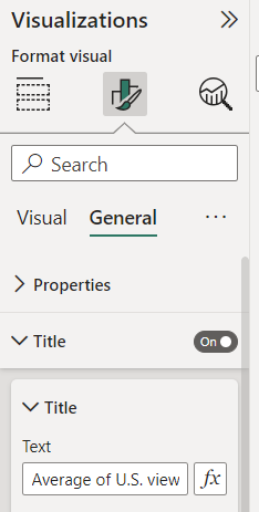
→ Go to the “Visualizations” pane
→ Click on “Format Visual” → General → Title
→ Enter your new title in the text box.
Be purposeful and change the default titles to something that will make sense to your readers. The less they understand your labels, the less they will understand your data.
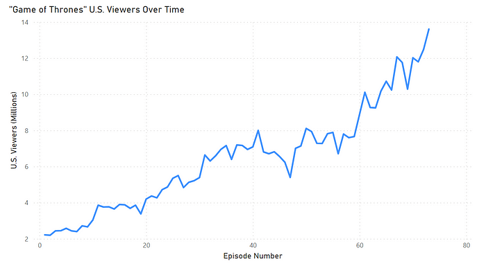
Now that I’ve changed the default title and X- and Y-axes for my graph on “Game of Thrones” viewership, the purpose of my visual is much clearer.
Mistake 2: Not taking advantage of custom Tooltips.
Tooltips provide additional context for data points in your visual. For example, if you don’t have enough space in your Power B.I. report, but want your employers to be able to dive into a specific data point as needed, you can create custom Tooltips.
When you hover over a data point in your visual, the “Tooltip” provides more information. In the line chart above, I want viewers to see the title and season of each episode, but I don’t have enough space to include all that information in the chart itself. Tooltips provide an easy solution to this problem.
When you create a visual, the default tooltip displays the data point’s value and category. But you can customize the Tooltip as needed.
To add a custom Tooltip:
→ Go to the “Fields” well of the “Visualizations” pane
→ Drag the field you want to include in the tooltips into the “Tooltips” bucket
→ Re-label the Tooltip labels as needed to make the chart more readable.

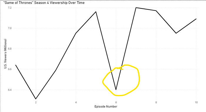
Mistake #3: Not looking into outliers in your data.
If there is a dramatic dip or rise in your data, double-check your data source to make sure that this is accurate. Look into possible explanations for the change. This variance could be accurate, or maybe someone put in an incorrect value before it was uploaded to Power B.I.
Either way, it is worth looking into — even if it just provides additional helpful context for understanding the rest of the data.
Mistake #4: Not staying consistent across charts.
It is crucial to stay consistent across all your charts, including titles, labels, colors, and units. It’s confusing to the reader if you have different titles across charts — e.g. “Sum of Salaries” vs. “Total Salaries.” It may mean the same thing to you, but your reader won’t necessarily know that.
If you use a different color in one visual versus another, your reader may make certain assumptions about what the difference in color means.
Be very intentional with any changes across your charts.
Mistake #5: Not being deliberate about color choices.
Avoid using colors unless they actually mean something — for example, they are your organization’s colors, or red means “below the target goal” and green means “meeting or above the target goal.”
Once you decide on your color schema, keep it consistent throughout your report(s).
To change the color of your lines:
→ Go to the “Visualizations” Pane
→ Click on Format Visual >Visual
→ Click on Lines and expand the Colors drop-down
→ Choose the color that makes sense for your graph.
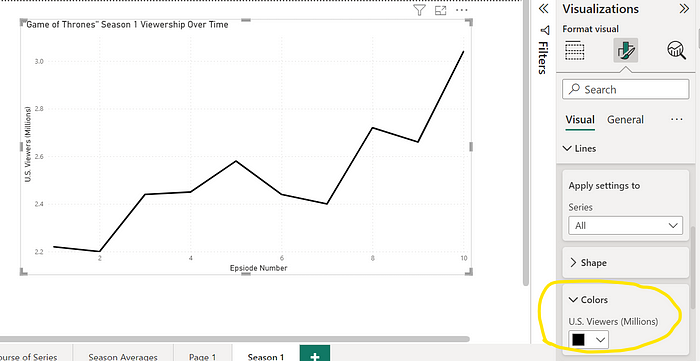
When choosing colors for your graph, ask yourself:
- What message do I want to convey?
- Will the audience instantly grasp my message? If not, how can I change my report to help them understand my message?
- Is my color schema consistent across my report?
- Are these colors accessible to viewers with colorblindness? (Note: The Color Blindness Simulator is a free online tool to test if a graph is colorblind-safe.)
Conclusion: KISS!
When designing your data visualization, whether it’s in Microsoft Power B.I., Excel, Tableau, or another tool, remember the slogan “KISS” — “Keep it simple, stupid!”
Be deliberate when choosing data labels, titles, tooltips, and colors, and keep those choices consistent across your report. The main goal of data visualization is to convey a message, not to impress your viewers with your extensive color palette.
Download My Free Guidebook
The 3-Step Plan for Getting Started With PowerBI
We hate SPAM. We will never sell your information, for any reason.

